Close
Start your project today+92 347 607 4399
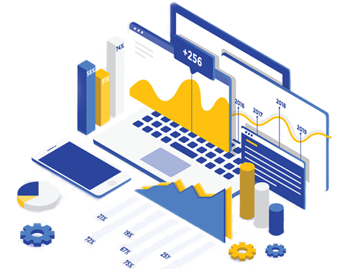

Data Visualization
Use Cases We Cover
-
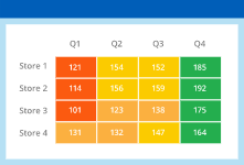
Financial
Tracking company’s revenue, expenses and profitability for improved financial forecasting and budget planning. Identifying and managing financial risks. Financial data monitoring.
-
Manufacturing
Evaluating overall equipment effectiveness and overall manufacturing processes Working to uncover faults in manufacturing processes to improve quality.
-
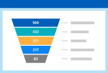
Supply Chain
Identifying demand drivers to improve demand planning accuracy and optimize order management. Monitoring procurement data and conducting spend analysis to identify rationalization opportunities. Spotting trends and patterns throughout the delivery process to identify and predict risks and optimize the logistics.